


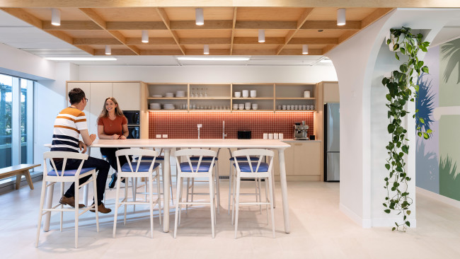


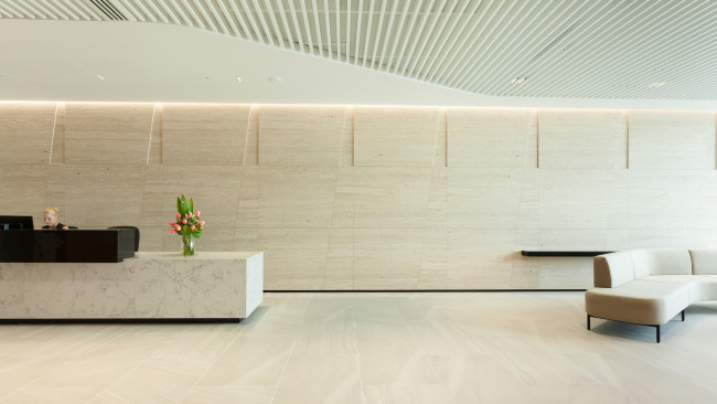


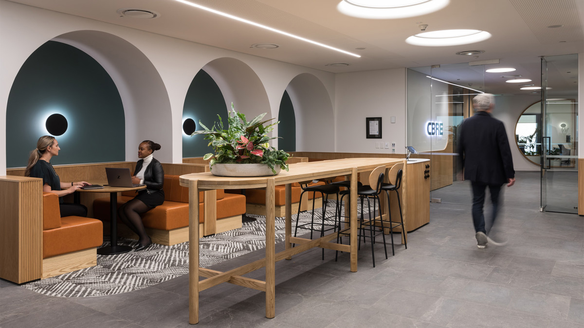

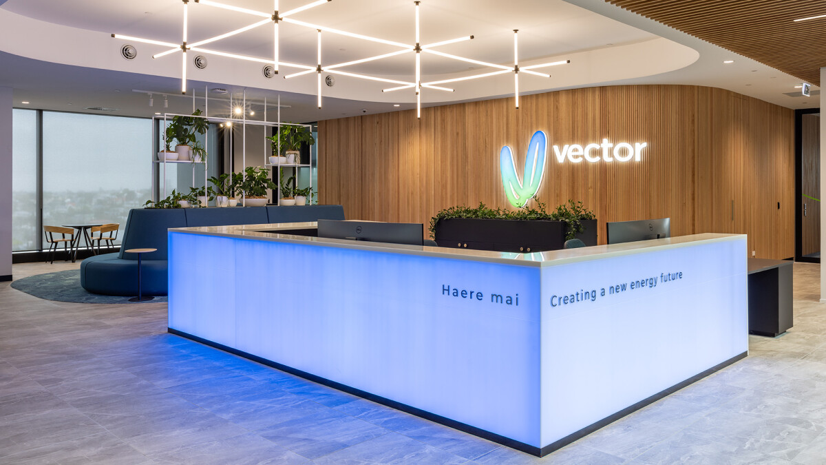


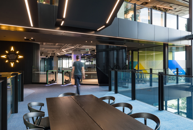
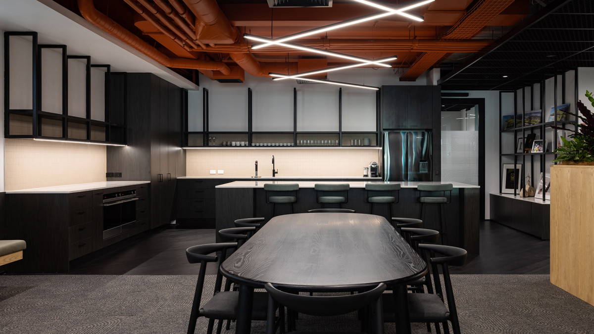


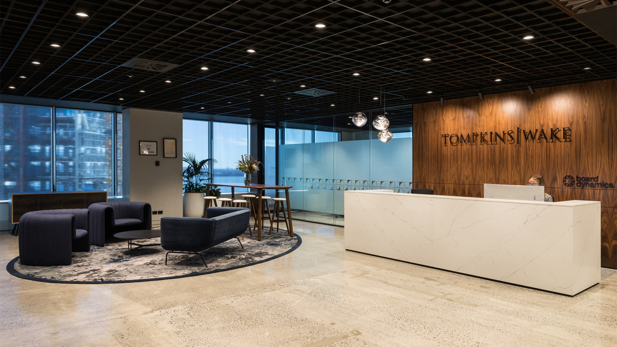
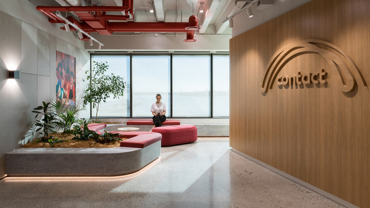


SERVICES
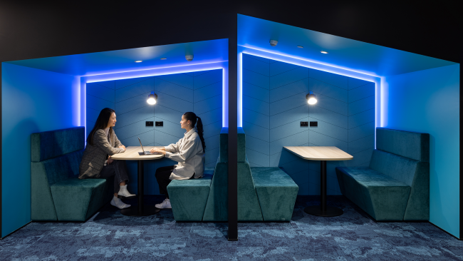
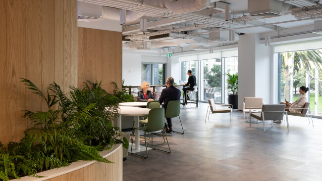
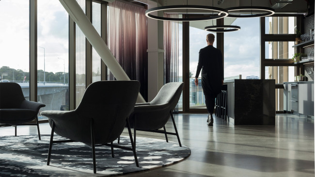
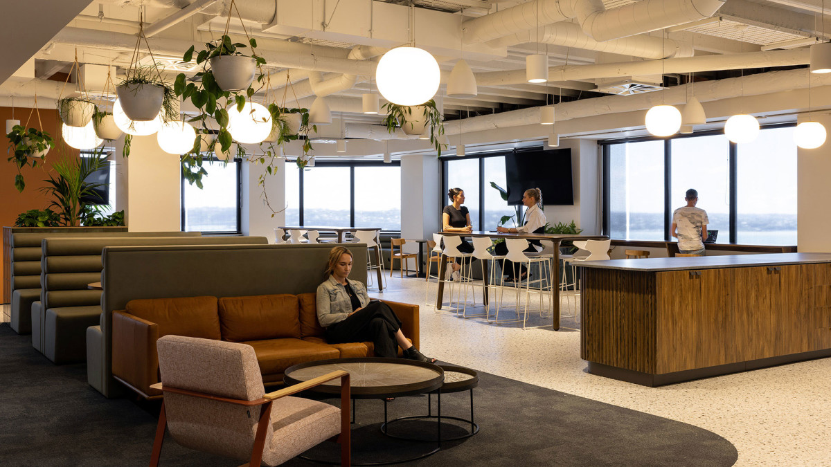
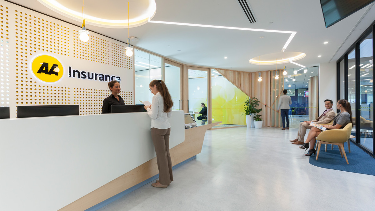
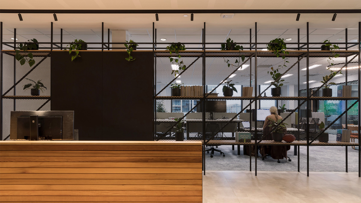
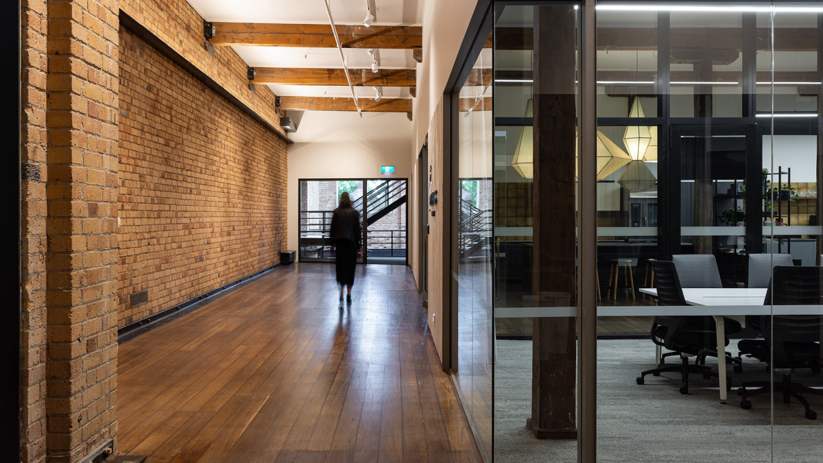
Collaborate, create and enjoy your workplace with our tailored design approaches
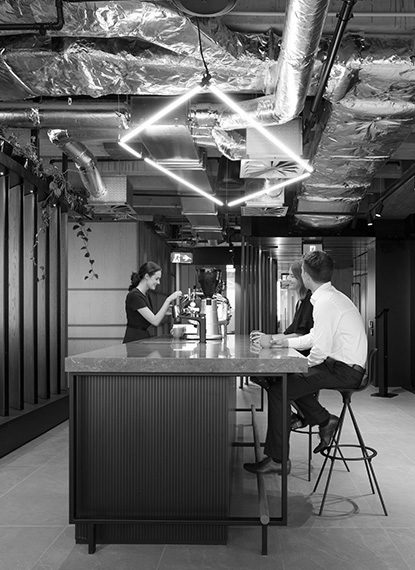
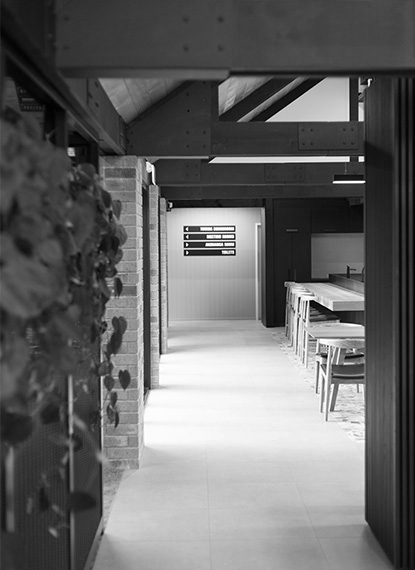
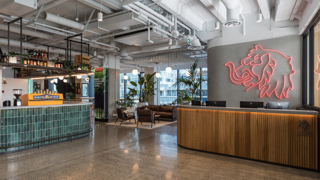
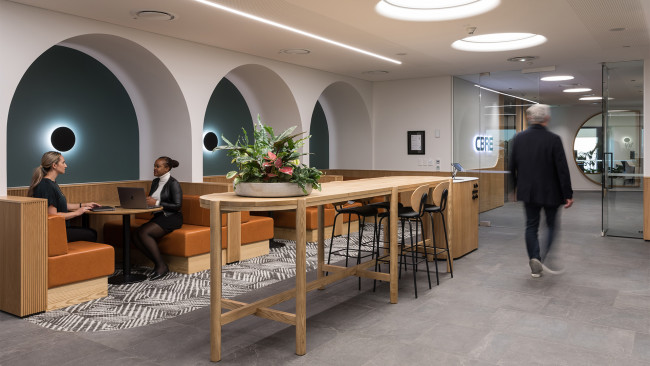
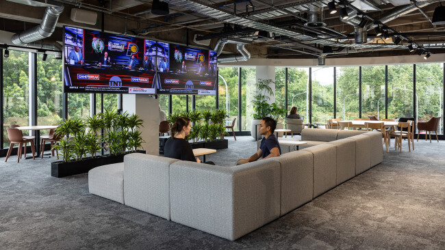
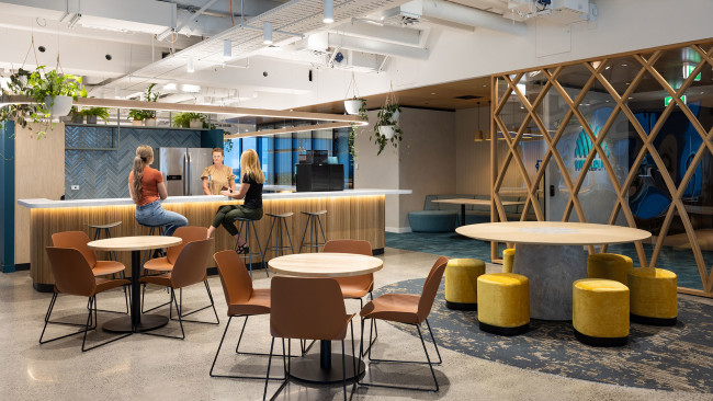
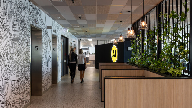
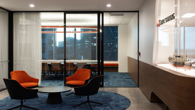
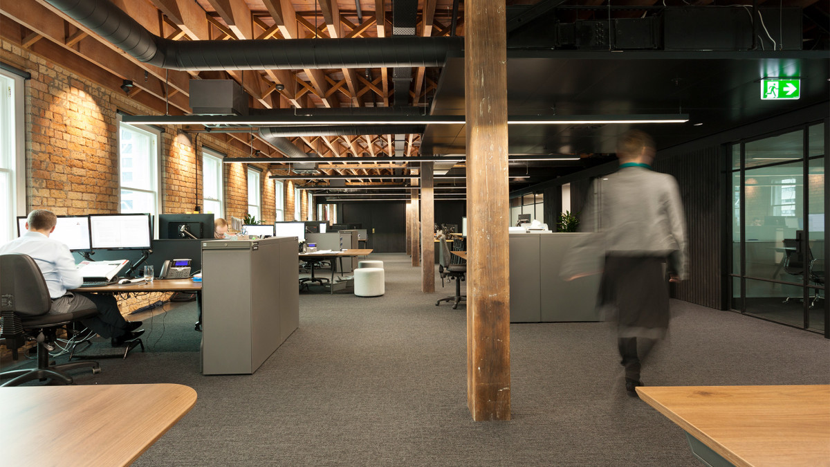
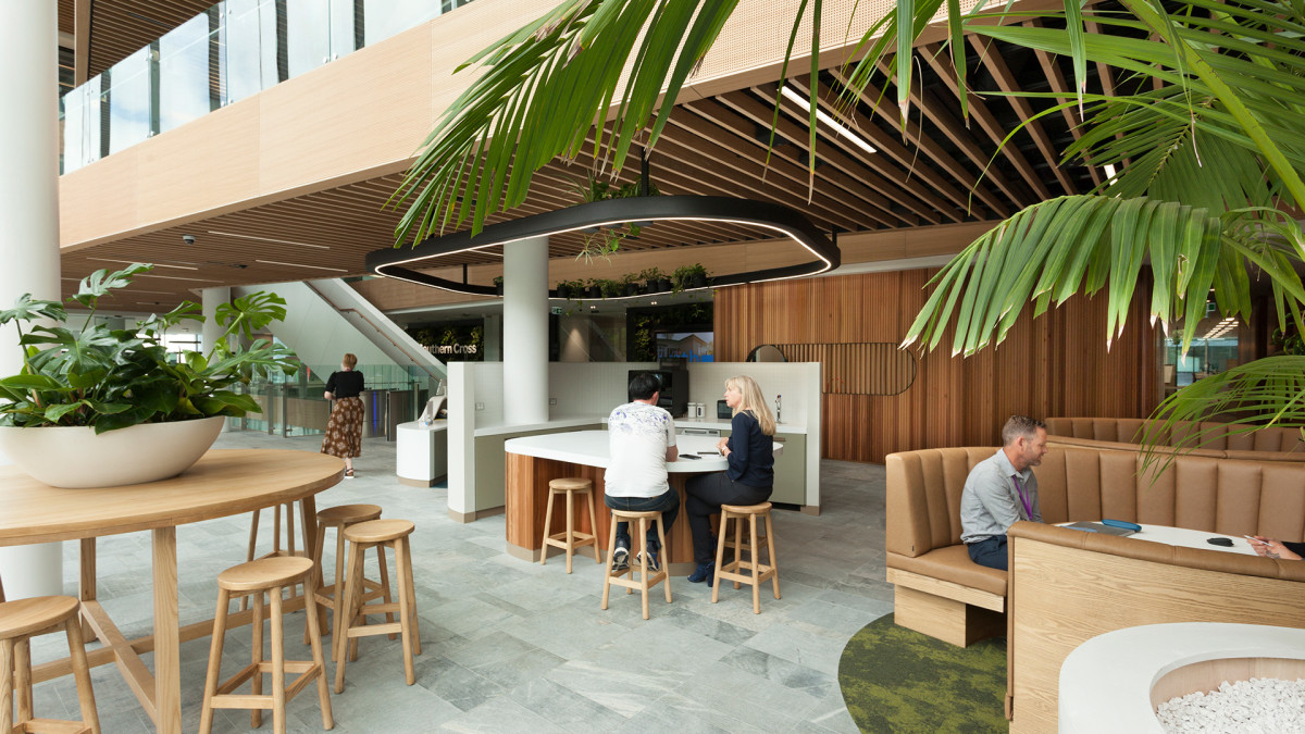
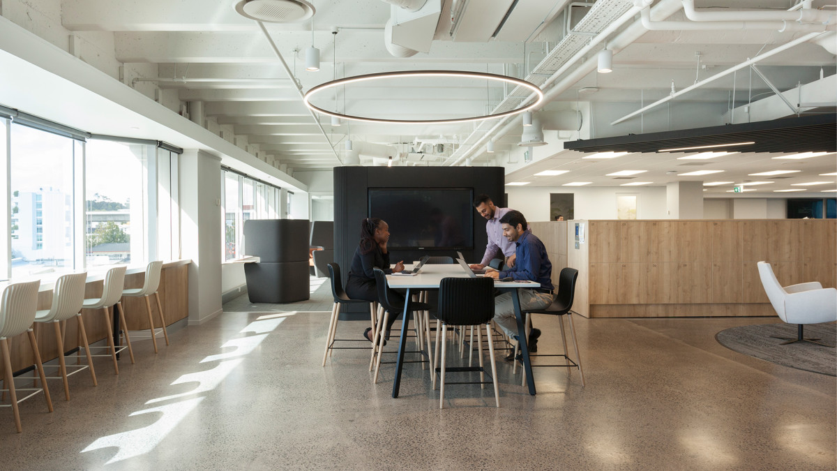
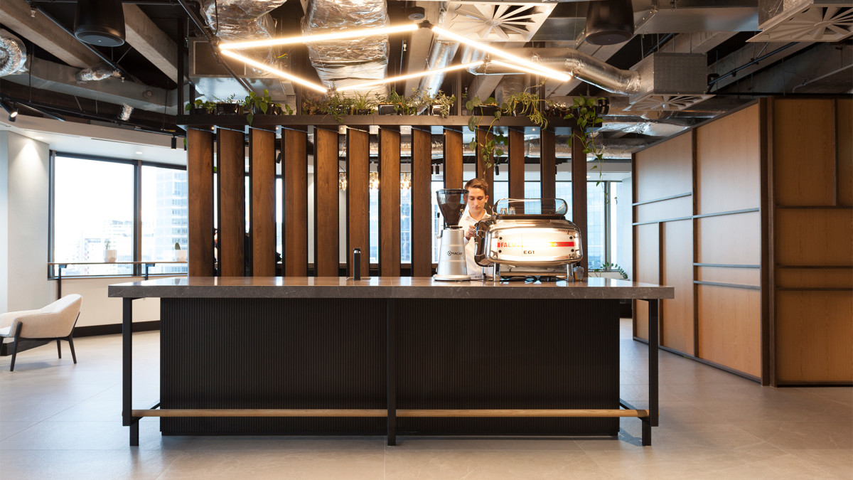
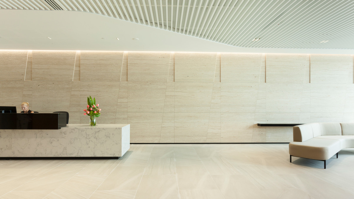
To truly succeed, your workplace needs to be somewhere people enjoy as they work together, collaborate and create. Our design-driven approach results in creative, unique business and office interiors that delight and inspire – and never compromise on functionality.